Last project - UI Case Study – Interfaces & Prototyping
UI Case Study – Interfaces & Prototyping
In this section you’ll find an overview of the UX research, analysis and prototyping activities I carried out as Lead Senior UX Designer on my most recent project.
Mission and challenges
I worked on a project for the European Committee of the Regions as a UX/UI Designer, focusing on a work platform dedicated to Committee Members. My role was to improve usability, harmonise design elements, and create clear, accessible interfaces across desktop and mobile. Through close collaboration with stakeholders and users, I delivered solutions that streamlined daily tasks and enhanced consistency.
Challenges:
Addressing diverse user needs: design platforms that support political members, contributors, and administrative staff, each with very different goals, responsibilities, and workflows.
Improving usability in a multilingual context: create interfaces that remain intuitive and efficient while accommodating multiple languages and cultural nuances.
Balancing specific vs. generalised features: evaluate user requests carefully, deciding when to implement tailored solutions and when to adapt them into scalable features for all users.
Ensuring cross-device consistency: design seamless experiences for desktop, tablet, and mobile, with a special focus on mobile-first usability.
Aligning stakeholders on design choices: communicate proposals clearly to users, business teams, and developers, building consensus and ensuring shared understanding of UX decisions.
Research & Analysis
The first phase focused on understanding the needs of both Committee Members and platform contributors. I organised interviews and regular workshops to observe their workflows, identify pain points, and gather feedback on existing tools.
For the Members’ work platform, my research revealed the need for more efficient ways to manage meetings, share reports, and communicate across devices. For the Extranet, the priority was to clarify contributor workflows and evaluate each request in order to decide whether a solution should be generalised for all users or kept specific to a single profile.
Throughout this phase, I acted as a facilitator: not only collecting requirements but also explaining design trade-offs, helping stakeholders understand the impact of their requests, and aligning them on decisions. This iterative dialogue ensured that the analysis phase produced actionable insights and prepared the ground for the design stage.
Revamp, Icons & Mockups
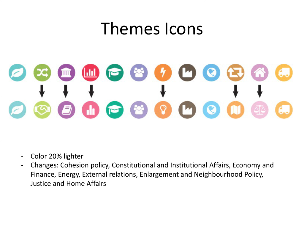
The project started with a visual revamp, introducing new icons and mockups aligned with the organisation’s graphic charter. These elements ensured consistency across the platform and provided stakeholders with a concrete preview of the final design. (PDF Option 1 & 2)
You can find more details on the documentation used for this study.
View Revamp (PDF) View Mockups (PDF)Navigation
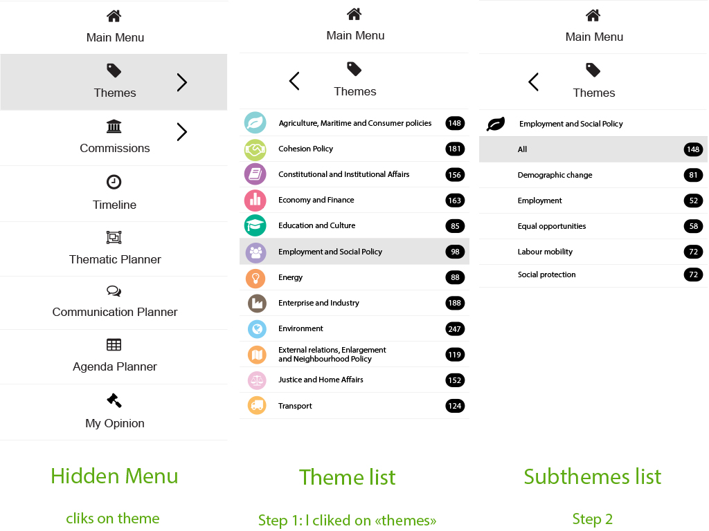
Different navigation structures were explored to improve user orientation and simplify access to key features. The proposed options aimed to reduce complexity and provide a smoother, more intuitive browsing experience. (PDF Option 1 & 2)
You can find more details on the documentation used for this study.
View Option 1 (PDF) View Option 2 (PDF)Footer Navigation
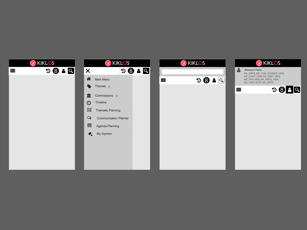
A simplified footer was designed to centralise secondary links and reduce clutter in the main navigation. This helped improve usability while maintaining alignment with accessibility standards. (PDF)
You can find more details on the documentation used for this study.
View Footer Navigation (PDF)Filters
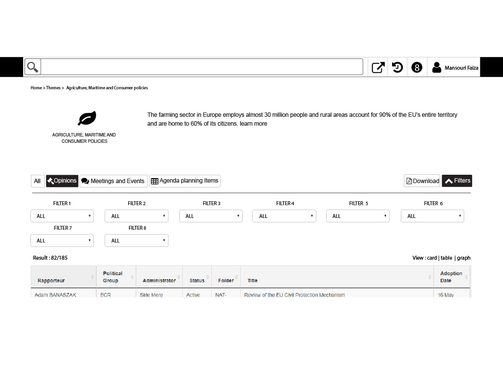
Filters were a central feature of the platform, enabling Members to quickly find relevant documents or actions. Multiple filter designs were tested to balance power and simplicity, ensuring users could refine results efficiently. (PDF Option 1 & 2)
You can find more details on the documentation used for this study.
View Filters Option 1 (PDF) View Filters Option 2 (PDF)Global Timeline (horizontale)
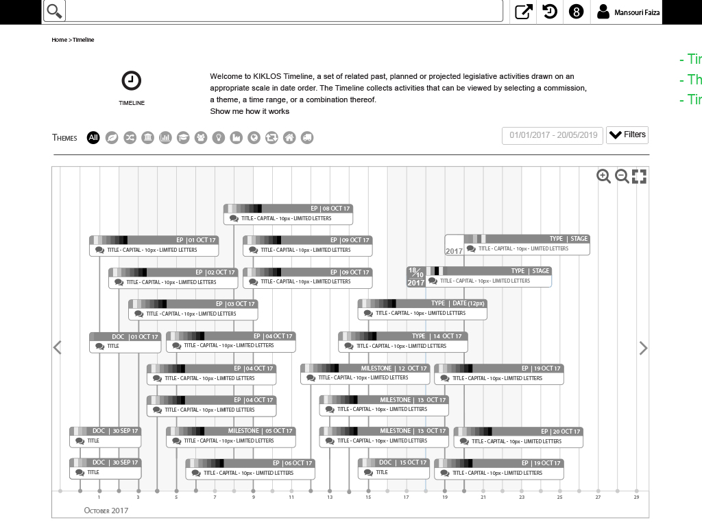
A horizontal timeline was designed to give Members a clear overview of processes and deadlines. This visual approach provided quick access to milestones while keeping information organised. (PDF Option 1 & 2)
You can find more details on the documentation used for this study.
View Timeline horizontale (PDF) View Timeline horizontale (PDF)Global Timeline (Circle graph)
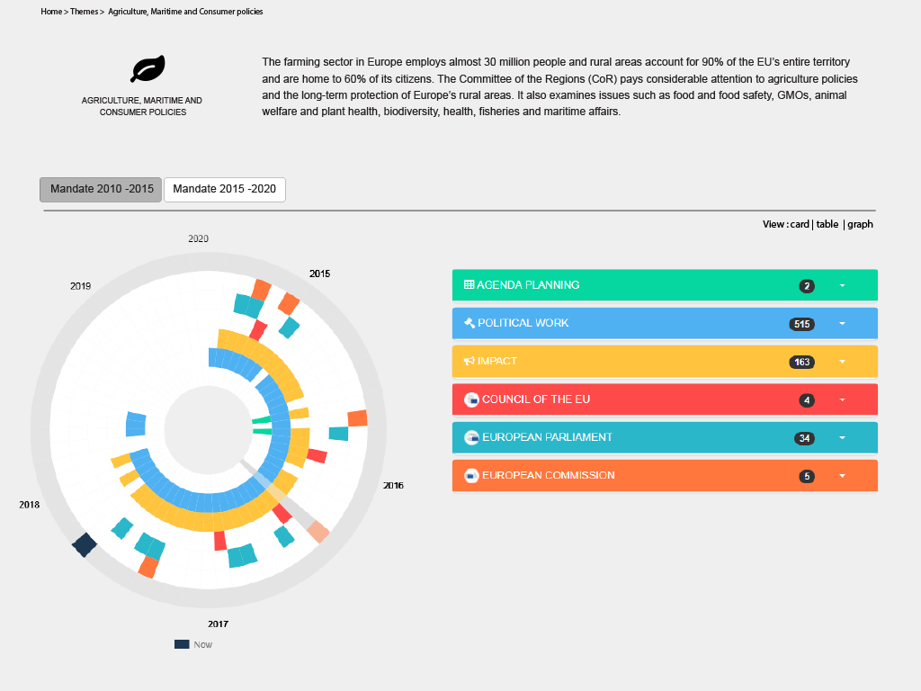
As an alternative, a circular timeline graph was developed to present the same data in a more visual, innovative way. This format helped highlight cycles and recurring events in a user-friendly manner.
You can find more details on the documentation used for this study.
View Timeline circle graph (PDF)Conclusion of the study
This UI case study highlights how design exploration and iteration were key to improving the Members’ platform. By testing multiple options — from navigation structures and filter systems to visual timelines and mockups — we ensured that every interface element was both functional and consistent with the organisation’s identity.
The process was collaborative and user-centred, providing stakeholders with concrete design options to validate before development. The result was a platform with a clearer structure, stronger visual harmony, and more intuitive interactions, ready to support Members in their daily work.