Last project - UX Case Study – Digital Ecosystem for Funding Platforms
UX Case Study – Digital Ecosystem for Funding Platforms
In this section you’ll find an overview of the UX research, analysis and prototyping activities I carried out as Lead Senior UX Designer on my most recent project.
Mission and challenges
The client needed a digital ecosystem made up of several platforms/APIs to manage and process funding requests from external organisations. Participating organisations first register on one platform, then submit their application through a second. These applications are received and analysed on a third interface, then scored by another user group via a fourth platform (with the results returned to the third) to determine whether funding will be granted. Once financing is approved, beneficiaries must submit their financial reports and outcome summaries through fifth and sixth platforms.
Challenges:
Harmonizing interfaces and user journeys: redesign the interface and user experience of each platform to provide intuitive navigation, while ensuring seamless continuity across different systems so that users perceive a cohesive ecosystem rather than a collection of tools.
Aligning with the visual identity: apply and extend the organisation’s brand guidelines across all interfaces, ensuring consistency in colour schemes, typography and graphic elements, and tailoring these standards to the specific constraints of each platform.
Coordinating teams and working methods: collaborate with development and product teams that have different schedules and working practices by synchronizing priorities, facilitating communication among stakeholders, and integrating necessary adjustments to meet deadlines and maintain quality.
Meeting technical and regulatory constraints: account for the limitations specific to each system (APIs, technologies used, security, accessibility) and ensure compliance with relevant standards (e.g., RGAA/WCAG for accessibility) to deliver an inclusive and secure experience.
Managing change and adoption: support users and teams during the transition to the new interfaces, communicate the improvements made, and collect feedback to refine the solutions.
Phase 1: Analysis of programs and studies
This section presents the analysis of the existing programs and studies. I described the research carried out to understand the context, the needs of the organisations and the functional constraints. To do so I navigated through every team and profile to have a better understanding of each user.
User details
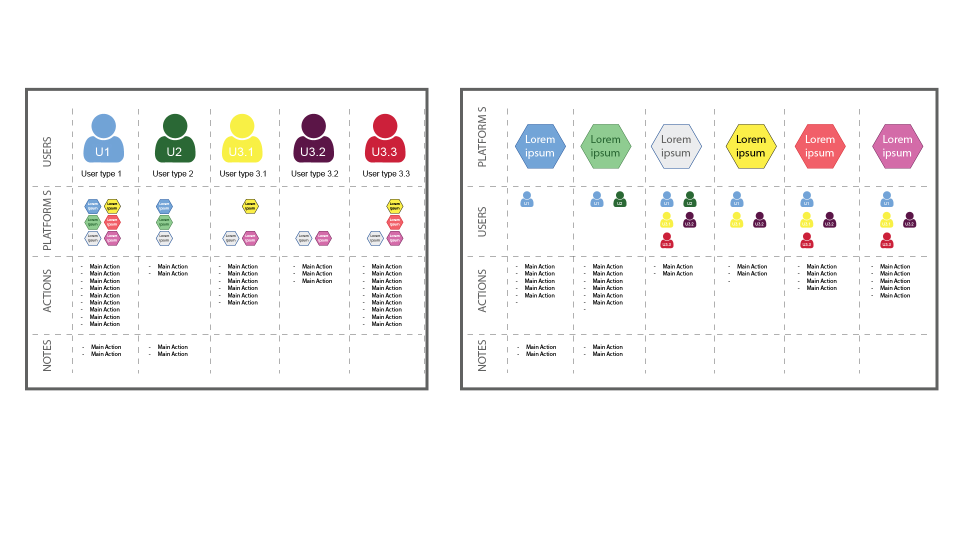
The digital ecosystem involves a diverse range of user types. Some participants are highly active, creating and submitting requests; others provide guidance and support along the way; and a third group oversees and reviews the activities of their peers. Each persona has its own goals, responsibilities and pain points, which I analysed in order to design interfaces and workflows tailored to their needs.
You can find more details on the documentation used for this study.
View user details (JPG)Users Metrolines
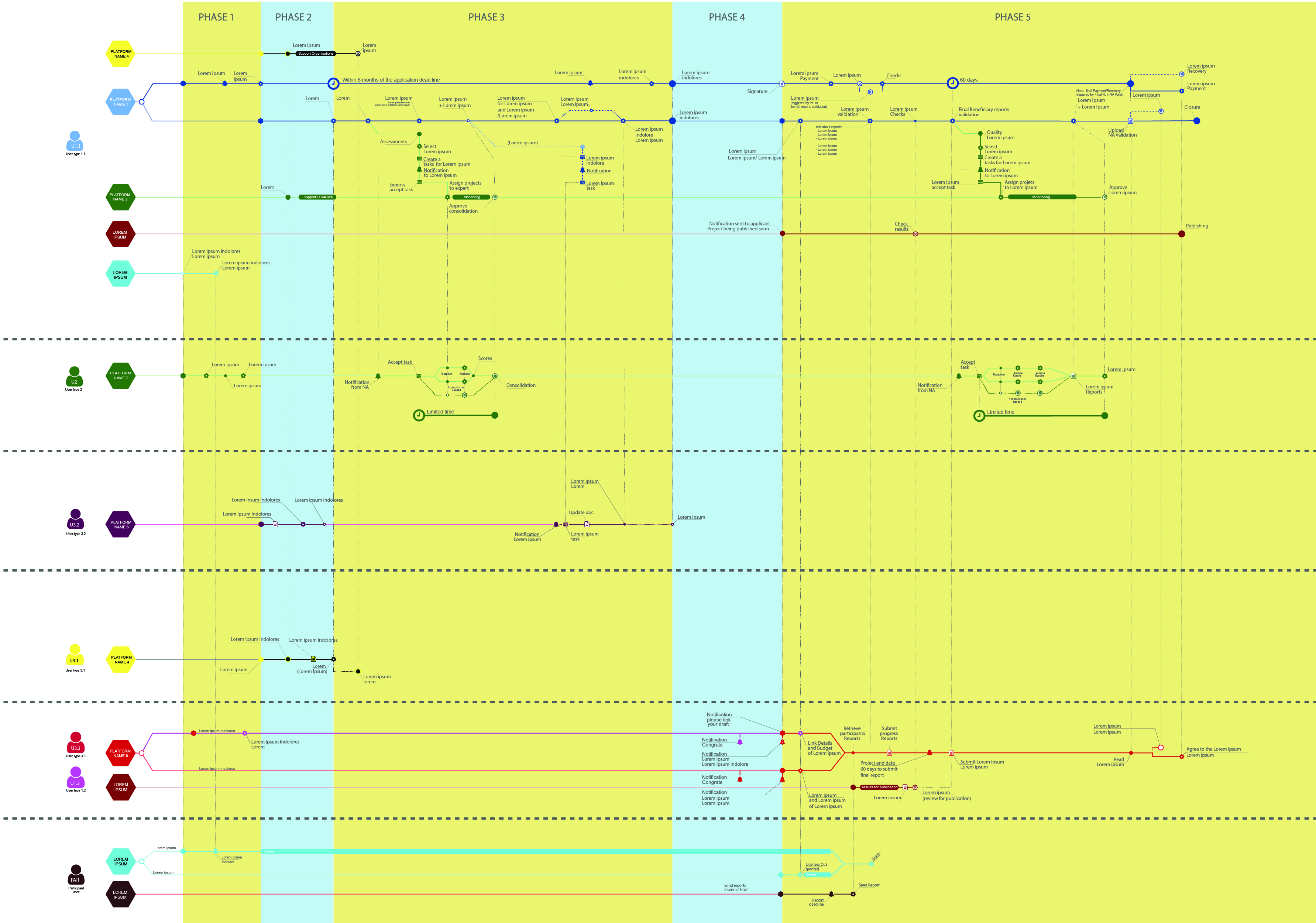
For each persona, I created user flow diagrams (metrolines) to visualise, in infographic form, how actions interconnect across the various systems and user types. Built from existing business processes, these user flows highlight dependencies, friction points and key transitions. They helped me understand how each profile navigates through the ecosystem and pinpoint opportunities for optimisation.
You can find more details on the documentation used for this study.
View metrolines (SVG)Mapping
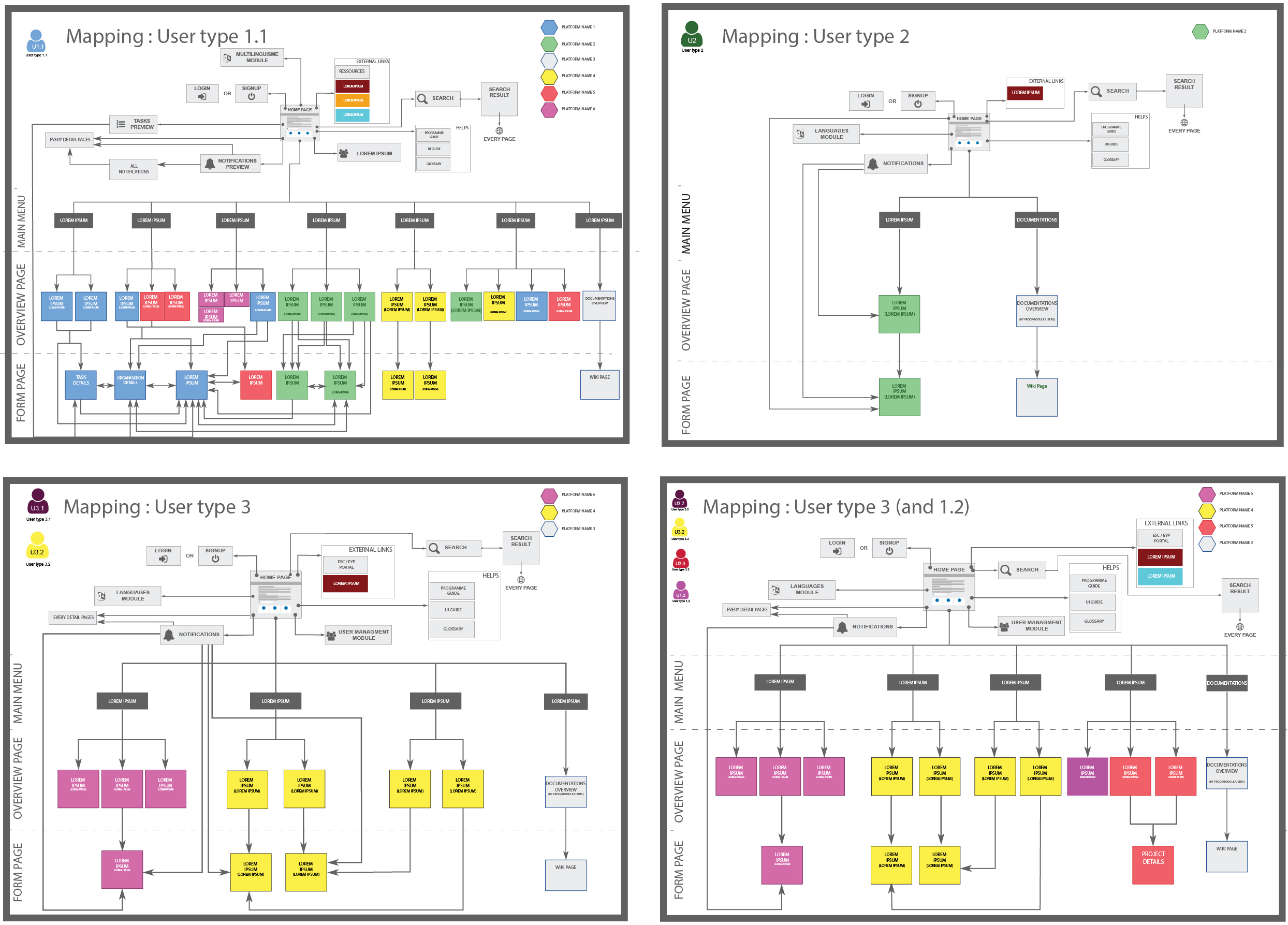
After completing the analysis and before starting the prototyping phase, I mapped out all the possible pages for each type user profile, documenting the actions available on each and the navigation paths between them. This mapping exercise helped structure the information architecture and ensure that all use cases were covered before moving on to screen design.
You can find more details on the documentation used for this study.
View user mapping (JPG)Conclusion of the first phase
Although my initial brief was to improve the UX and UI of each system independently while adhering to the brand guidelines, taking over the project revealed deeper issues. User feedback was clear: the systems’ designs were too disparate, the interfaces felt overly complex and the various platforms didn’t communicate with one another.
To address this, we identified several key directions:
- Dedicated menus: introduce a menu specific to each user type, visible on every page, to guide actions and simplify navigation.
- Strong harmonisation: beyond a similar look and feel, adopt identical designs for pages of the same type, creating consistent visual cues across the ecosystem.
- Horizontal alignment: synchronise cross platform changes and developments to ensure functional and visual coherence from one system to the next.
Phase 2: Building the interfaces
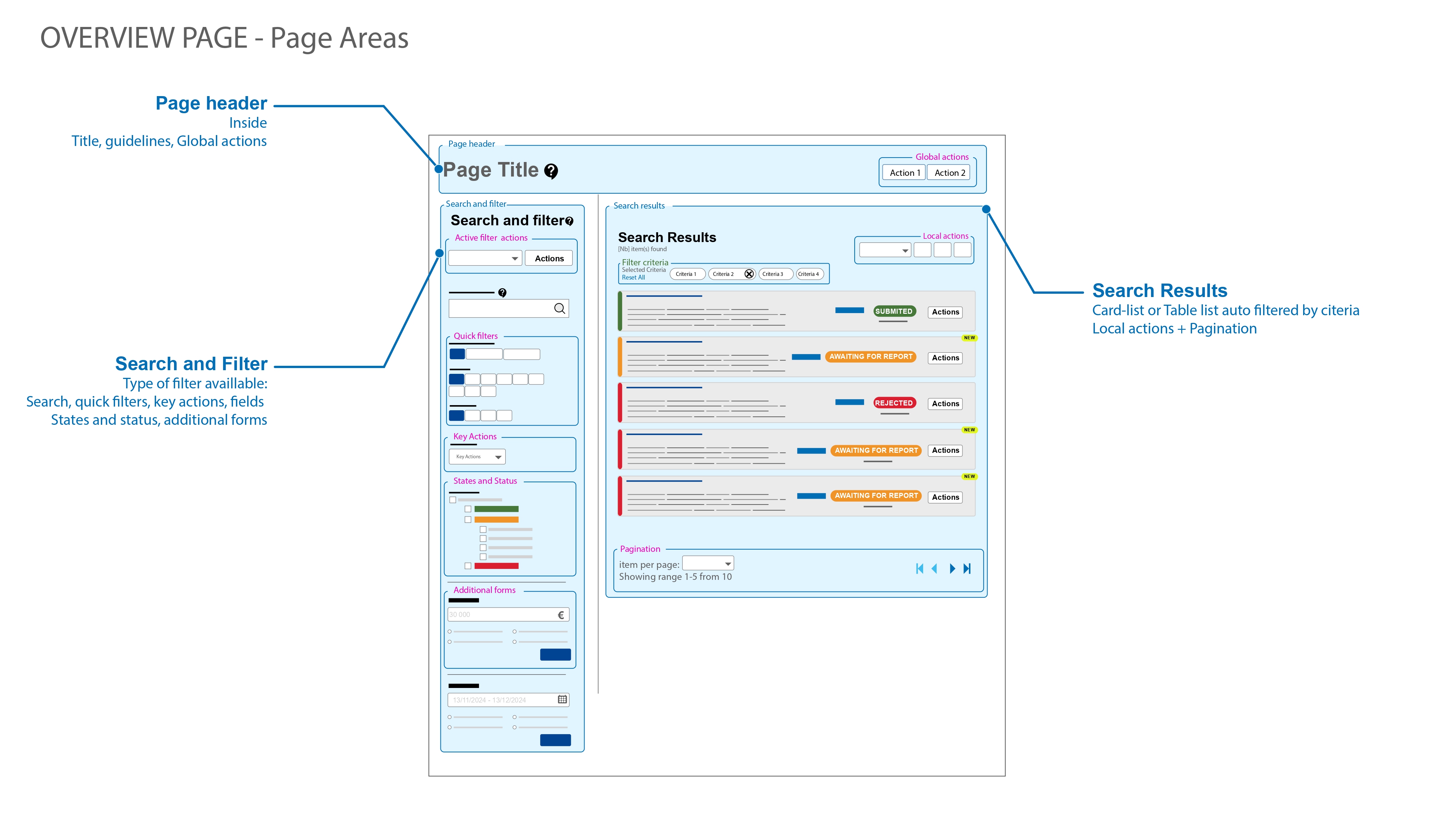
After synthesising our research, the second phase focused on turning those insights into tangible design artefacts. One of the key directions identified at the end of phase 1 was to adopt identical layouts for pages of the same type, giving users consistent visual cues across the ecosystem. Our goal was to explore and validate these solutions before committing to final development, while navigating the project’s technical constraints and adhering to the organisation’s graphic charter. The following sections trace that progression—from interactive prototypes through low‑fidelity wireframes to high‑fidelity mockups—and include multi‑page PDFs that illustrate each stage of the work.
Prototyping
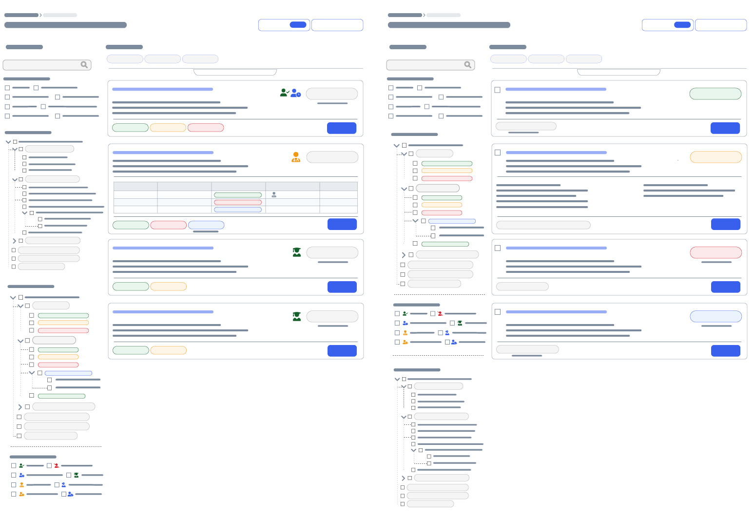
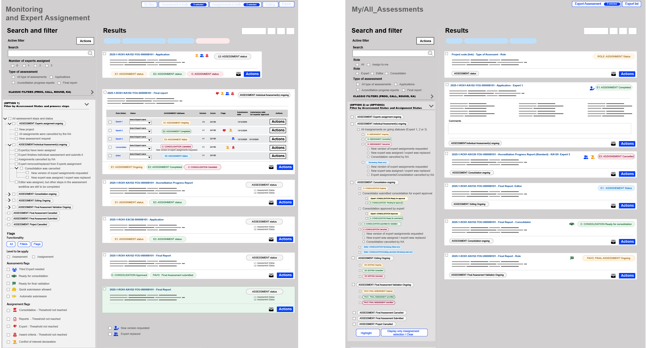
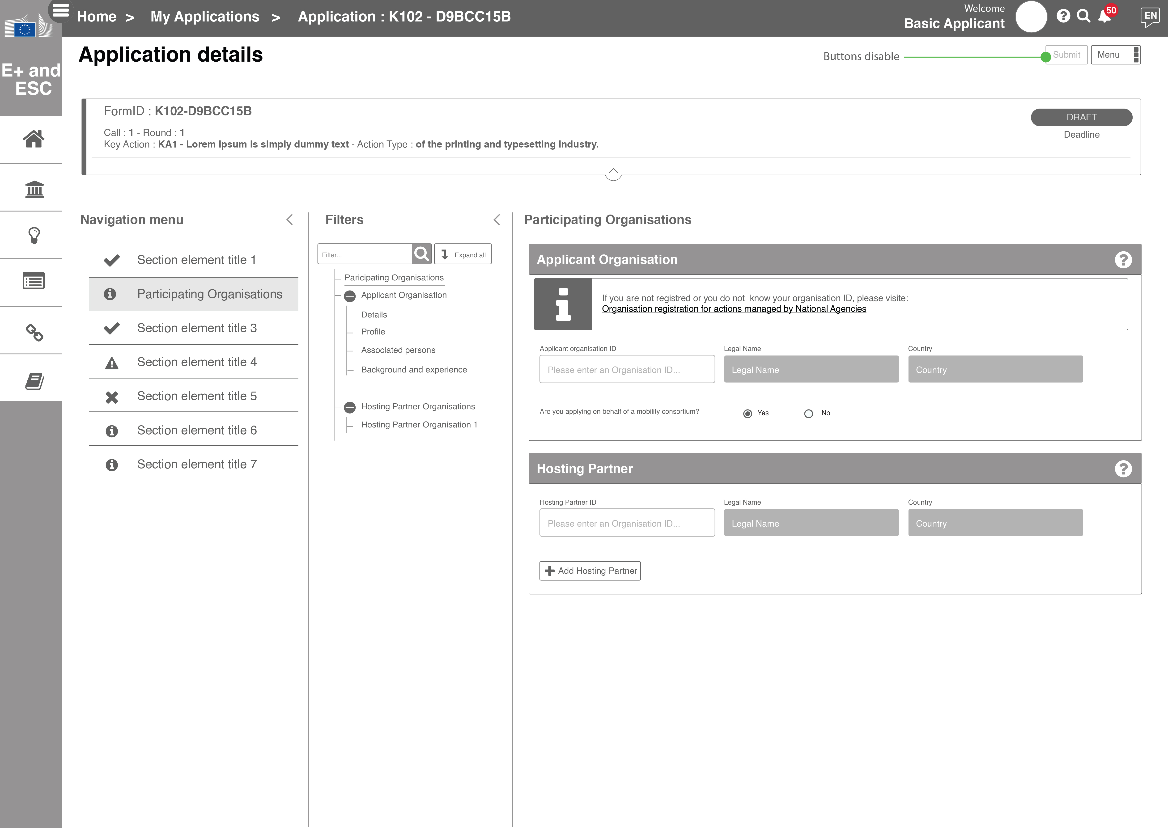
The prototypes draw heavily on the templates defined by the brand guidelines. The PDF below presents a representative sample of the interfaces we created. We structured the system around three page types: OVERVIEW, DETAILS and COMMON.
OVERVIEW: accessible via the dedicated menu for each user type, this view lists all items by category and provides intuitive filtering options. Key data is summarised in cards or in each table row, and it serves as the gateway to the other pages.
DETAILS: available only from an overview page, this view reiterates the overview summary at the top and organises all information within a secondary menu on the left, enabling users to navigate between sections.
COMMON: used for displaying external help links, documentation or reference text, this page groups shared components and features. It doesn’t include filters or a secondary menu. Mostly public pages.
You can find more details on the documentation provided to the teams.
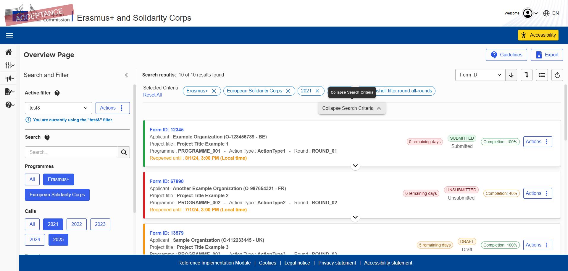
View prototyping sample (PDF)Wireframes
Wireframes are a crucial link between the analysis phase and the visual design. They allow me to clearly represent all the elements identified in Phase 1—whether user flows (metrolines) or page maps. By stripping away visual styling, these sketches focus on the structure of each screen: they ensure that every action and piece of information is in the right place and that each page covers the full range of user needs. They also make it possible to present several options for organising filters or data, giving business stakeholders room to actively contribute to the layout of the pages. In this way, wireframes act as a blueprint to check for consistency and completeness before moving on to more detailed mockups.
You can find more details on the documentation provided to the stakeholders.
View wireframes sample (PDF) Open in FigmaMockups
The wireframing phase engaged business stakeholders and kicked off a collaborative effort to build each page one by one. At the same time, business analysts and product owners began drafting the business specifications, making sure to describe the wireframe elements as precisely as possible to avoid any misinterpretation during development or testing. While the wireframes already give a fairly accurate idea of the outcome, the mockups provide a final visual preview before implementation. It’s important to note, however, that the labels and some text in the mockups are not always final, since they’re often created before the functional specifications are complete. The agreed rule is therefore that, in the event of any discrepancy between a mockup and the specifications, the specifications take precedence for developers and testers. Two example PDFs accompany this section: the first shows a comprehensive set of mockups that closely match the final result, and the second uses lorem ipsum text for areas where content was not yet defined at the time.
Two example PDFs are provided, illustrating different platforms delivered to stakeholders.
View AF mockup (PDF) View AM mockup (PDF)Conclusion of the second phase
Phase 2 marked the transformation from research into actionable design and was the true meeting point for all disciplines involved in the project. Through collaborative prototyping, we explored and validated solutions that aligned with the organisation’s vision and technical constraints. Wireframing then provided a structural blueprint, ensuring that every user journey, filter and data element was accounted for and giving business stakeholders a chance to shape the layout. Finally, high‑fidelity mockups crystallised the look and feel of each page, offering a realistic preview while allowing room for refinement once specifications were finalised. By bringing designers, business analysts, product owners, developers and testers around the same artefacts, this phase laid a solid foundation for the next stage of documentation and implementation.
Phase 3: Documentation and technical specifications
With all profiles now engaged across the various projects, it became essential to produce a clear set of documentation that every team can rely on. Phase 3 is dedicated to defining the vocabulary, design rules and functional details that will guide designers, developers and testers alike. This reference material ensures that everyone speaks the same language, understands how each component is intended to work and can implement the solutions consistently, even when working in parallel.
Naming
The first step was to establish a shared vocabulary. To improve efficiency and avoid misunderstandings, we created naming conventions that align as closely as possible with developer terminology. By standardising the names of actions, components and data fields, we ensure that business stakeholders, designers and developers all refer to the same concepts in the same way, reducing the risk of information loss or confusion during implementation and testing. A PDF accompanying this section provides examples of the agreed terminology.
You can find more details on the documentation provided to the teams.
View Naming (PDF)Style guide
This section provides detailed documentation on the implementation of the Angular components used on each page. The accompanying PDF inventories all components, includes links to access the source code and precisely describes how each one works through screenshots showing every state (default, hover, active, etc.). Its purpose is twofold: to ensure that developers adhere strictly to the design and behavioural guidelines, and to enable business analysts to include direct references to these components in their specifications. With this documentation, the entire team has a clear reference for building interfaces that are consistent and faithful to the design intent.
You can find more details on the documentation provided to the teams.
View style guide (PDF)Filtering system
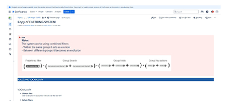
The filtering system on the OVERVIEW page is the backbone of the user experience. This page lists the entirety of available items and allows users to select what they want to see. Because of its central role, the filtering system is documented in detail, with clear descriptions of its behaviour, available criteria, default states and visual conventions. The goal is to ensure that the same filtering logic is applied consistently across all overview pages so that users always know how to narrow down information. The corresponding PDF explains the system step by step and provides examples.
You can see more details of the type of the documentation provided to the Devellopers.
View Filtering system (PDF)Generalities
Because I worked on multiple projects at once, I also needed a common set of terms and patterns to describe recurring interactions. Here the vocabulary is closer to the designer’s point of view. For example, actions that apply globally to a page—often displayed at the top right—are referred to as global actions. Actions that affect only a particular section are called local actions, while those that target a single item are individual actions. These general definitions help everyone understand the scope of each control, regardless of the project. A detailed PDF outlines these categories and other cross‑project guidelines.
You can see more details of the type of the documentation provided to the Business Analysts.
View Generalities (PDF)Specifications
Some pages deviate from general patterns and require deeper, bespoke work. For these unique or complex screens, I wrote specific functional specifications that describe the expected behaviours, data structures, interactions and edge cases in detail. These documents serve as authoritative references for developers and testers when implementing or validating features that aren’t covered by the general rules. A PDF in this section shows how these specifications are structured and what level of detail they contain.
You can see more details of the type of the documentation provided to the Business analysts.
View Specifications (PDF)Guidelines and Contextual help
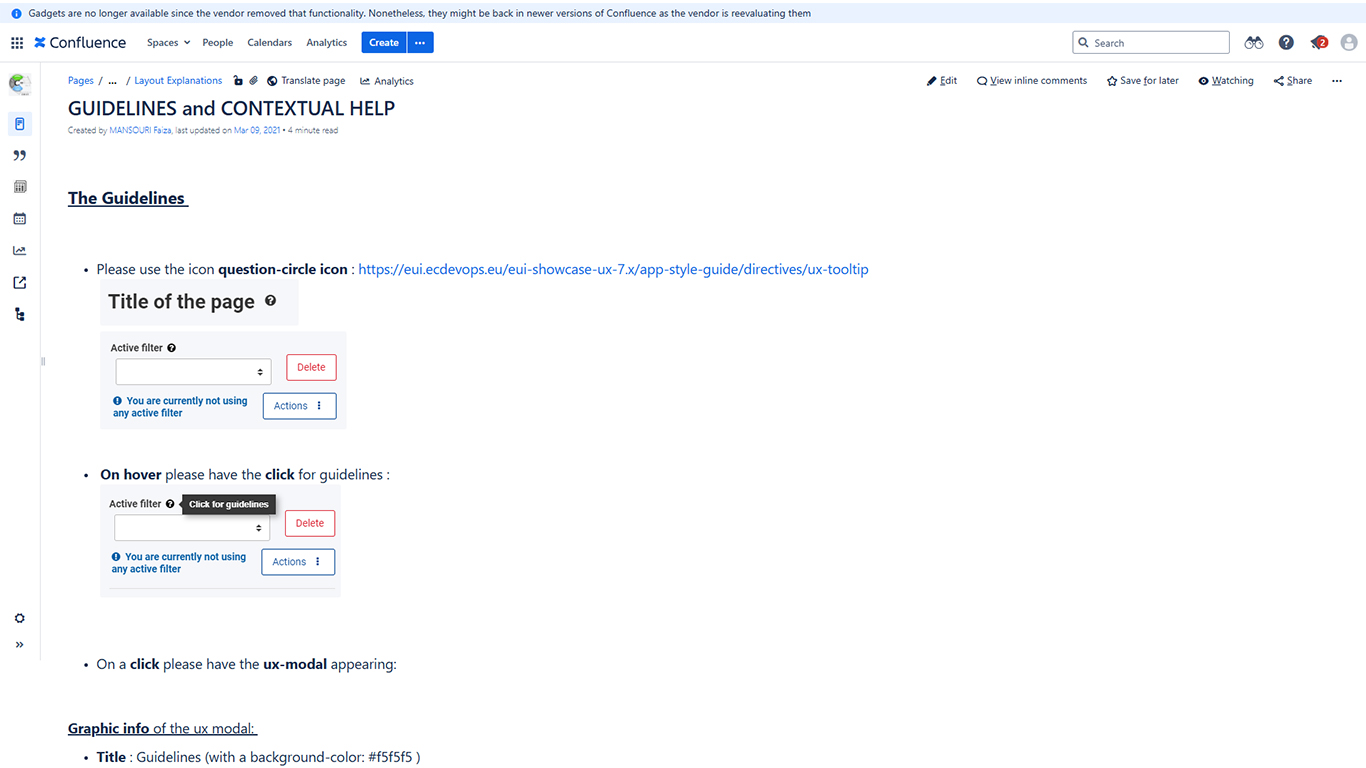
To assist users without forcing them to read lengthy manuals, we developed guidelines and contextual help texts. These short descriptions explain how key functionalities work—such as saving selected filter criteria or using the search bar—and are integrated directly into the interface where users need them. The aim is to make complex pages self‑explanatory and reduce friction, while still providing links to deeper documentation if required. An accompanying PDF illustrates several examples of in‑context guidance and the guidelines governing their tone and placement.
You can see more details of the type of the documentation provided to the Business Analysts.
View Guidelines and Contextual help (PDF)Conclusion of the third phase
Phase 3 laid the foundation for coherent and sustainable development by formalising our design and functional decisions. By defining a common vocabulary, clarifying general interaction patterns, documenting the core filtering system, detailing page‑specific requirements and embedding user guidance, we created a comprehensive toolkit that every team can use. This documentation not only ensures consistency and quality across all platforms, but also empowers each contributor to work autonomously without losing sight of the shared vision. With this reference material in place, the project is ready to move forward confidently into implementation and future iterations.